Redesigning the onboarding experience for Jira by Atlassian.
Context
Solo Project
Winter 2025
UX Researcher Product Designer
My Role
Product Focus : Onboarding Experience for First-Time Users
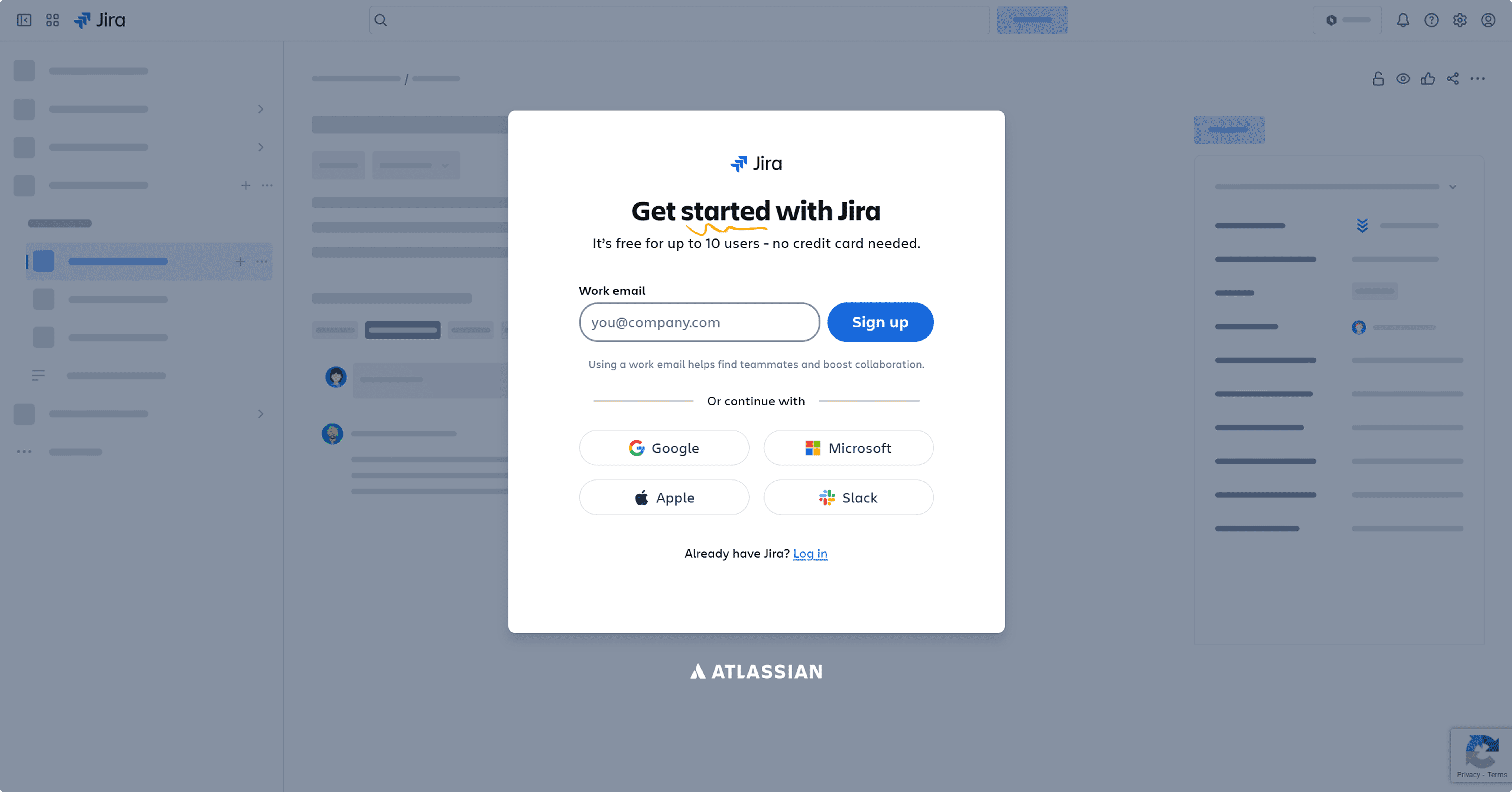
Jira is a cloud-based project management tool by Atlassian, used by teams across software, marketing, HR and operations to track and manage work.
Originally built for developers, it's now one of the most widely used collaboration tools in the world.

research
Understanding where users were getting lost.
I gathered insights through surveys, interviews and a competitive analysis of leading project management tools followed by usability testing with first-time users.


Usability testing findings :
I asked a group of first-time users to complete Jira's onboarding flow and then share their experience ,covering how they felt throughout the journey, from signing in and setting up to the quick tour.


Abhi
Utkarsha

Here's what happened...
60% dropped off right after launching them to space.
The setup felt too long with questions that felt unnecessary.
90% rushed through the quick tour or skipped it entirely.
Users expected to understand the layout first - instead they were thrown into a feature-by-feature tour.
Competitive analysis :
A few things stood out across other tools that Jira was missing.
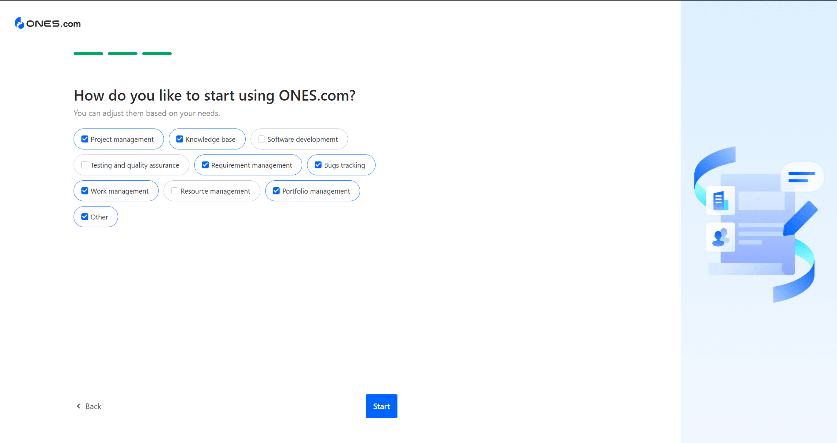
PROGRESS INDICATOR : All three tools showed users where they were in the process like "4 of 6 steps done." Jira shows nothing.
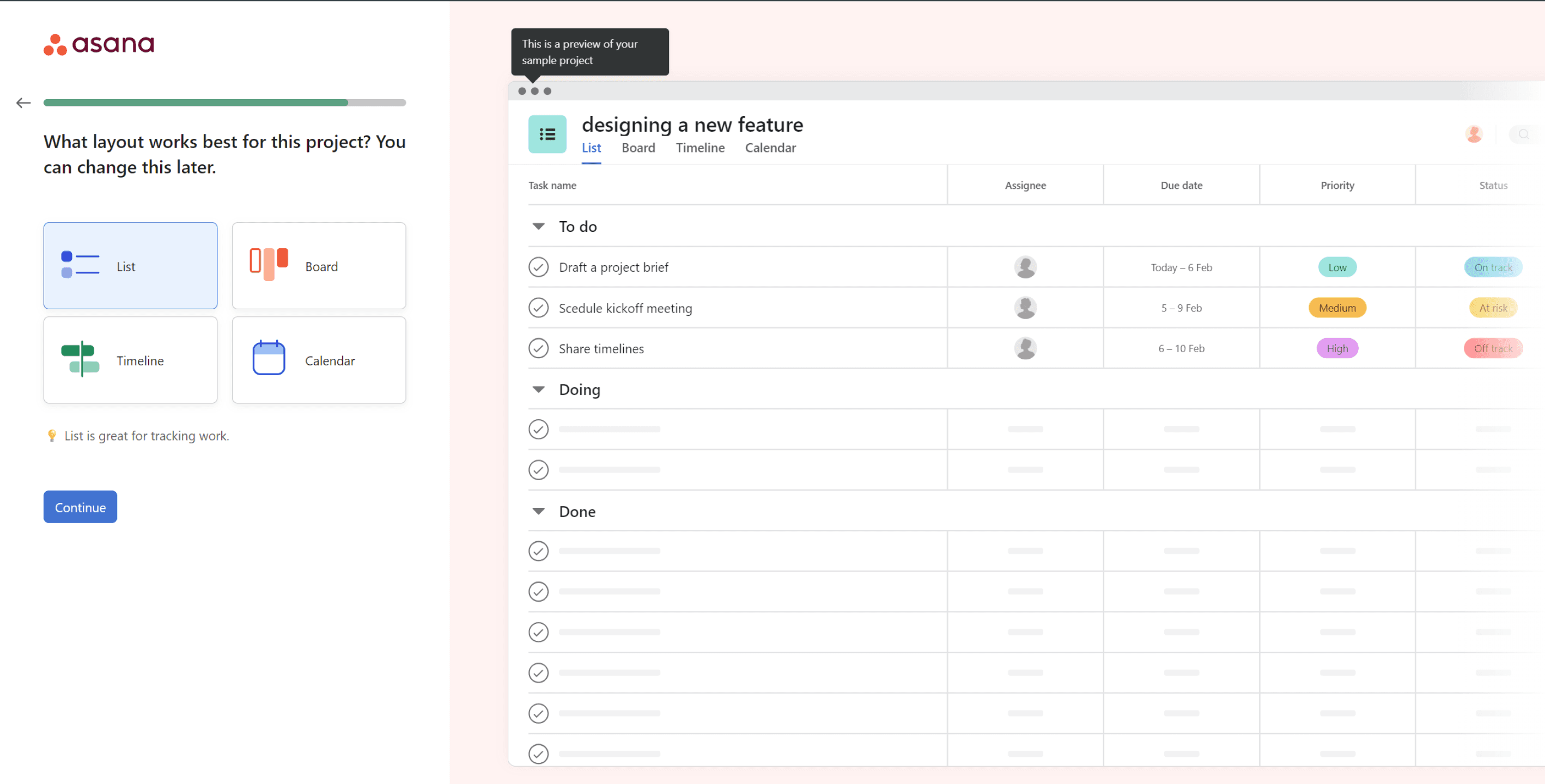
PREVIEW SCREENS : Large, clear previews of the actual workspace during onboarding helped users build a mental model before they arrived there. Jira offers none of this.
PREVIEW SCREENS : Large, clear previews of the actual workspace during onboarding helped users build a mental model before they arrived there. Jira offers none of this.
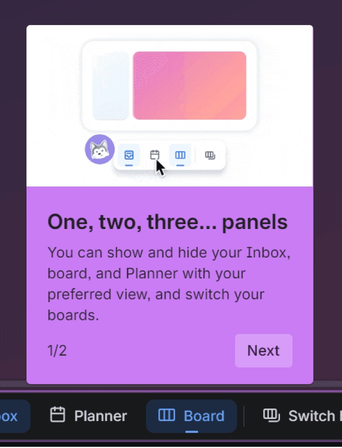
SPATIAL TOUR FIRST : Their quick tours started with the interface - what lives where , before introducing any features. Jira jumps straight to features.
VISUAL CLARITY : Cleaner UI during the tour made it easy to scan and follow along. Jira's tour is text-heavy and difficult to navigate visually.
PREVIEW SCREENS : Large, clear previews of the actual workspace during onboarding helped users build a mental model before they arrived there. Jira offers none of this.
focus
Problem Statement :
New users who are unfamiliar with similar tools often feel confused and overwhelmed when they first open the product. They struggle to understand what the tool does, where to start, and how to complete basic actions without guidance. This leads to hesitation, mistakes, or users dropping off before experiencing the tool’s real value. As a result, the product fails to create confidence and ease during the user’s first interaction.
How might we Statement :
How might we help first-time users quickly understand the tool and feel confident using it from the very first interaction through beginner friendly onboarding and quick start journey that builds understanding instead of confusion?
WORK
Decision 1 — Redesigned Onboarding Flow & Screens:
Setup felt too long, too demanding, and asked questions users didn't understand yet. 60% dropped off right after login.
So I simplified the flow, reduced unnecessary questions, used friendly language throughout and added a progress indicator so users always knew where they were in the process.
Decision 2 — Spatial Tour Before Feature Tour
Jira's existing tour jumped straight into features ,before users even understood what lived where. 90% skipped it entirely.
I redesigned the tour to start with spatial orientation , a clear overview of the interface and what lives where before introducing any features. Giving users a mental model first.
Decision 3 — AI Chat Agent
Even after onboarding, questions kept coming. Jira's existing AI is task-focused , not built to help new users understand quires.
So I designed an in-tool AI chat agent , a low-pressure way for users to ask basic questions, get oriented, and build confidence without leaving the product.
Outcome
A/B testing matrix — original Jira onboarding against the redesign.
I validated the redesign through moderated usability testing with 6 first-time Jira users (the same group from initial research).
Methodology: 15–20 minute remote sessions with a clickable prototype. Users attempted to complete onboarding and rated their experience.
Note: This was a small-scale student project (n=6). Real-world impact would need larger samples and live A/B testing.
dROP-OFF RATE
Before
60%
After
0%
Before
20%
After
80%
CLARITY
QUICKTOUR SKIPPED
Before
80%
After
10%
Before
low
After
High
uSER CONFIDENCE
This project wasn't about making Jira simpler. Jira's complexity is what makes it powerful.
It was about making sure first-time users got far enough to discover that power themselves.